
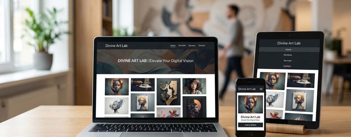
Today, customers don’t just browse websites from computers. They use smartphones and tablets to search for products, compare services, read reviews, contact businesses, and make purchases.
That means your website needs to work perfectly on every screen size.
A mobile-friendly website is no longer a luxury—it is an essential part of a successful digital presence. If your website is difficult to navigate, slow to load, or poorly displayed on mobile devices, potential customers may leave before they ever contact you.
At Divine Art Lab, we create modern, responsive, and business-focused websites designed to provide a smooth user experience across smartphones, tablets, laptops, and desktops.
Let’s understand why having a mobile-friendly website is so important for your business.
What Is a Mobile-Friendly Website?
A mobile-friendly website is designed and developed to provide a seamless browsing experience on mobile devices.
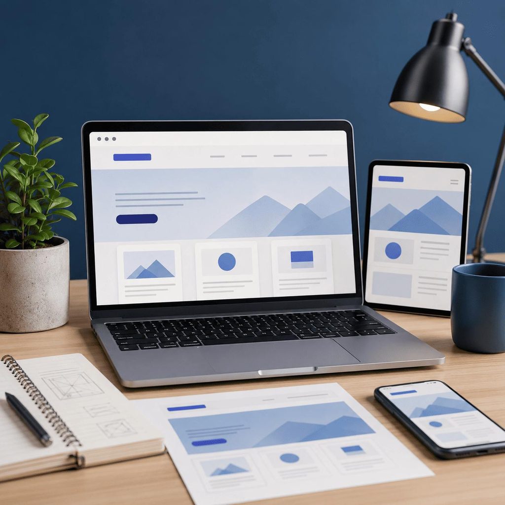
Instead of forcing users to zoom, scroll horizontally, or struggle with small buttons, a responsive website automatically adjusts its layout, images, text, menus, and other elements according to the visitor’s screen size.
A mobile-friendly website should offer:
- Responsive design
- Easy navigation
- Readable text
- Mobile-friendly buttons
- Fast loading speed
- Properly optimized images
- Easy-to-use contact forms
- Smooth browsing across devices
The goal is simple: make it easy for visitors to find what they need and take action.
Why Is Mobile-Friendly Website Design Important?
Your website is often the first interaction a potential customer has with your business.
If the website looks outdated or doesn’t work properly on mobile, visitors may question the quality and professionalism of your business.
A responsive website helps create a better first impression while making it easier for users to explore your products or services.
Here are some of the biggest benefits.
1. More People Browse on Mobile Devices
Smartphones have become one of the primary ways people access the internet.
Customers may discover your business while searching on Google, viewing social media, clicking an advertisement, or receiving a recommendation.
If your website isn’t optimized for mobile, you risk losing visitors who are already interested in what you offer.
A mobile-responsive website ensures that your business is accessible whenever and wherever customers search for you.
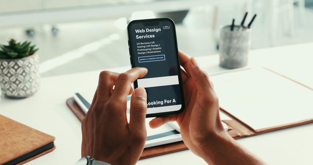
2. Better User Experience
User experience can directly influence whether a visitor stays on your website or leaves.
Imagine a customer visiting your website on their phone and finding:
- Tiny text
- Difficult menus
- Buttons that don’t work
- Images covering important information
- Slow-loading pages
- Content that doesn’t fit the screen
That’s a frustrating experience.
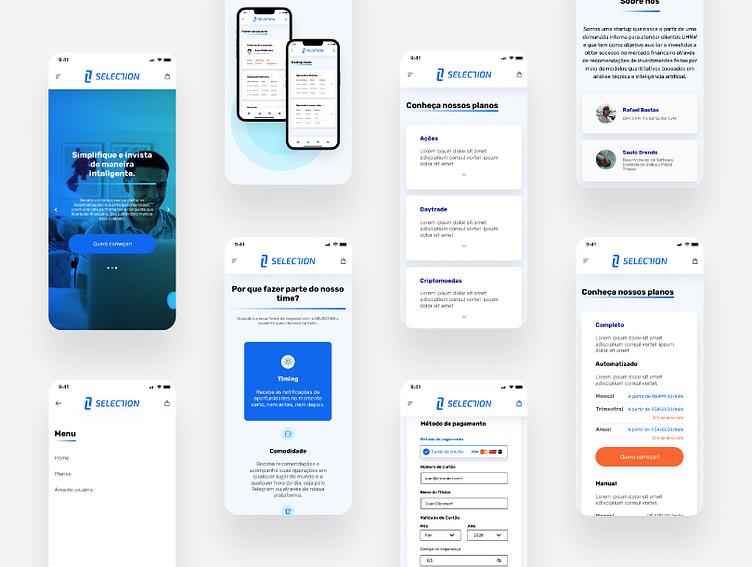
A mobile-friendly website eliminates these problems and provides a cleaner, simpler browsing experience.
Better experience = more engagement = better chances of conversion.
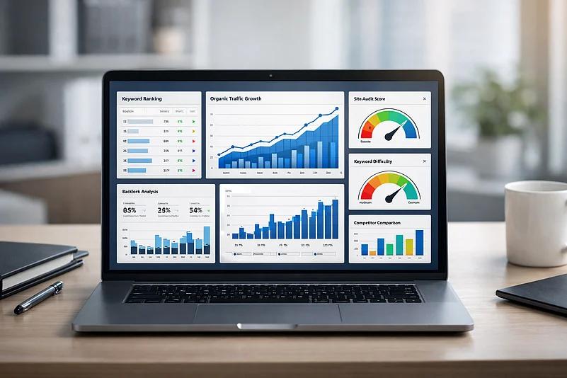
3. Helps Improve Your SEO Performance
Mobile-friendliness is an important part of modern website optimization.
Search engines want to provide users with websites that offer a good experience across devices. A responsive website can therefore support your overall SEO strategy.
However, mobile responsiveness alone doesn’t guarantee higher rankings. Your website should also have:
- High-quality content
- Relevant keywords
- Fast performance
- Proper technical SEO
- Clear website structure
- Optimized images
- Secure HTTPS
- Good user experience
When these elements work together, your website has a stronger foundation for search visibility.
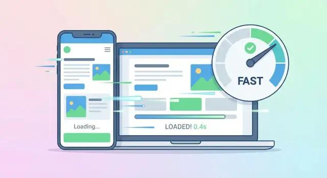
4. Faster Website Loading
Mobile users expect websites to load quickly.
If a page takes too long to load, visitors may simply go back and choose another website.
Website speed can be affected by large images, unnecessary code, poor hosting, excessive plugins, and unoptimized website elements.
A professional website development approach focuses on optimizing these elements to create a faster and smoother experience.
5. Builds Trust and Professionalism
Your website represents your brand online.
A modern, responsive website can make your business appear more professional and trustworthy.
On the other hand, a website that looks broken or outdated on mobile devices can create doubts about your business.

Customers are more likely to engage with a business when its digital presence feels professional, reliable, and easy to use.
6. Makes It Easier for Customers to Contact You
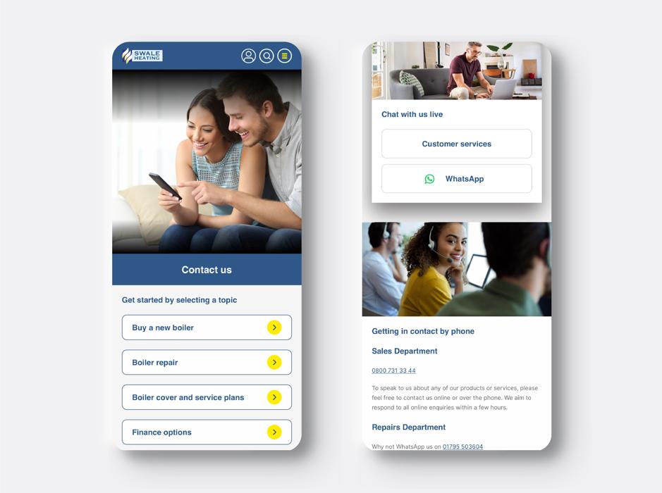
For many businesses, the main purpose of a website is to generate enquiries.
Your mobile website should make it simple for visitors to:
- Call your business
- Send a WhatsApp message
- Fill out an enquiry form
- Request a quote
- Find your location
- Send an email
- Purchase a product
When these actions are easy to access on mobile, you can reduce friction and improve your chances of generating leads.
7. Supports Higher Conversions
A website isn’t just an online brochure. It can be an important part of your sales process.
A well-designed mobile website guides visitors toward the next step.
For example:
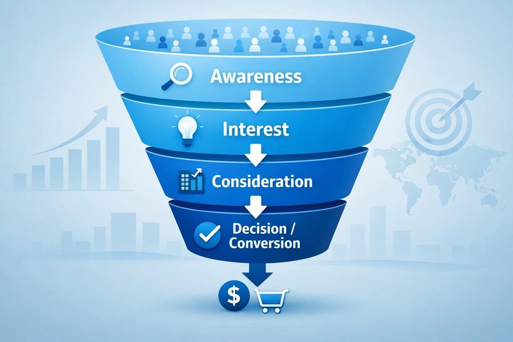
Google Search → Website → Service/Product → Call/WhatsApp/Form → Lead → Customer
If your website creates friction at any point, you may lose potential customers.
Responsive design, clear calls-to-action, simple navigation, and fast-loading pages can help create a smoother path toward conversion.
8. Improves Your Social Media Advertising Experience
Businesses often send traffic to their websites through platforms such as Facebook and Instagram.
A customer may see your advertisement on their smartphone, click it, and land on your website.
Now imagine your advertisement looks professional, but the website doesn’t work properly on mobile.
You could lose a potential customer—and your advertising investment may not deliver the results you expected.
That’s why your website design and digital marketing strategy should work together.
9. Gives You a Competitive Advantage
Your competitors are also competing for your customers online.
If their website is faster, easier to navigate, and more mobile-friendly than yours, customers may choose them instead.

A modern responsive website gives your business a stronger digital presence and helps you compete more effectively.
10. One Website Works Across Multiple Devices
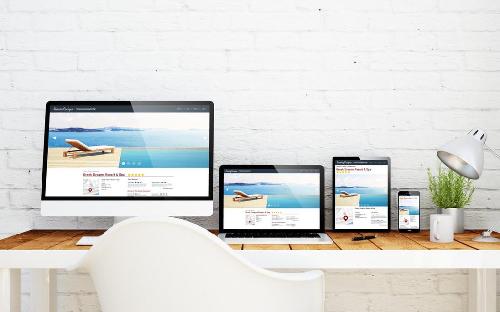
With responsive web design, you don’t need to create a completely separate website for every device.
A properly developed responsive website can automatically adjust to:
- Smartphones
- Tablets
- Laptops
- Desktop computers
- Different screen resolutions
This makes website management easier while providing a consistent brand experience.
Mobile-Friendly Website vs. Non-Mobile-Friendly Website
| Feature | Mobile-Friendly Website | Non-Mobile-Friendly Website |
|---|---|---|
| Responsive layout | Yes | Often No |
| Mobile navigation | Easy | Difficult |
| Text readability | Optimized | May require zooming |
| Buttons | Touch-friendly | Difficult to use |
| Images | Responsive | May overflow |
| Loading experience | Optimized | Often slower |
| User experience | Smooth | Frustrating |
| Conversion potential | Higher | Can be lower |
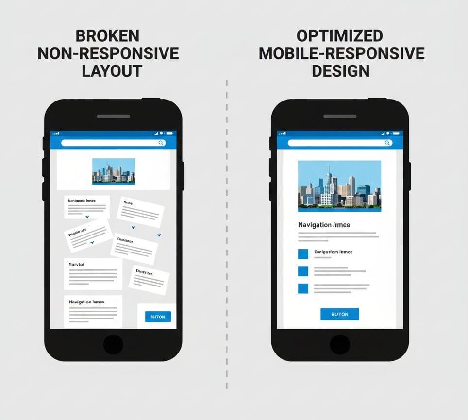
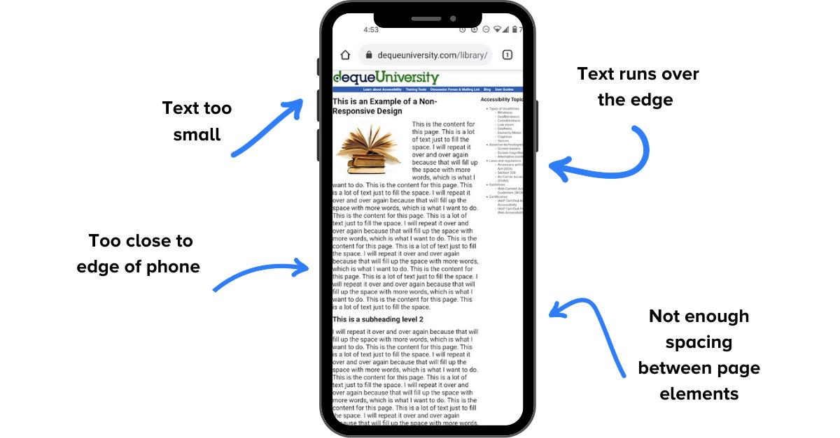
How to Know If Your Website Is Not Mobile-Friendly
Your website may need improvement if:
- Visitors have to zoom in to read content.
- The website doesn’t fit properly on mobile screens.
- Buttons are difficult to tap.
- Menus are difficult to use.
- Images extend beyond the screen.
- Pages take too long to load.
- Forms are difficult to complete.
- Important information is difficult to find.
- Some pages or buttons don’t work correctly on mobile.
If you notice several of these issues, it may be time to consider a website redesign or professional website development.
What Makes a Good Mobile-Friendly Website?
A high-quality responsive website should combine design, technology, content, and usability.
Important elements include:
Responsive Design
The website should automatically adapt to different screen sizes.
Simple Navigation
Visitors should be able to find important information quickly.
Fast Loading
Pages should be optimized for speed and performance.
Clear Calls-to-Action
Buttons such as Call Now, Get a Quote, Contact Us, Buy Now, or WhatsApp Us should be easy to find.
Professional UI Design
A modern interface creates a stronger first impression and improves usability.
Optimized Images
Images should maintain good quality without unnecessarily increasing page load time.
Mobile-Friendly Forms
Contact and enquiry forms should be simple to complete on smaller screens.
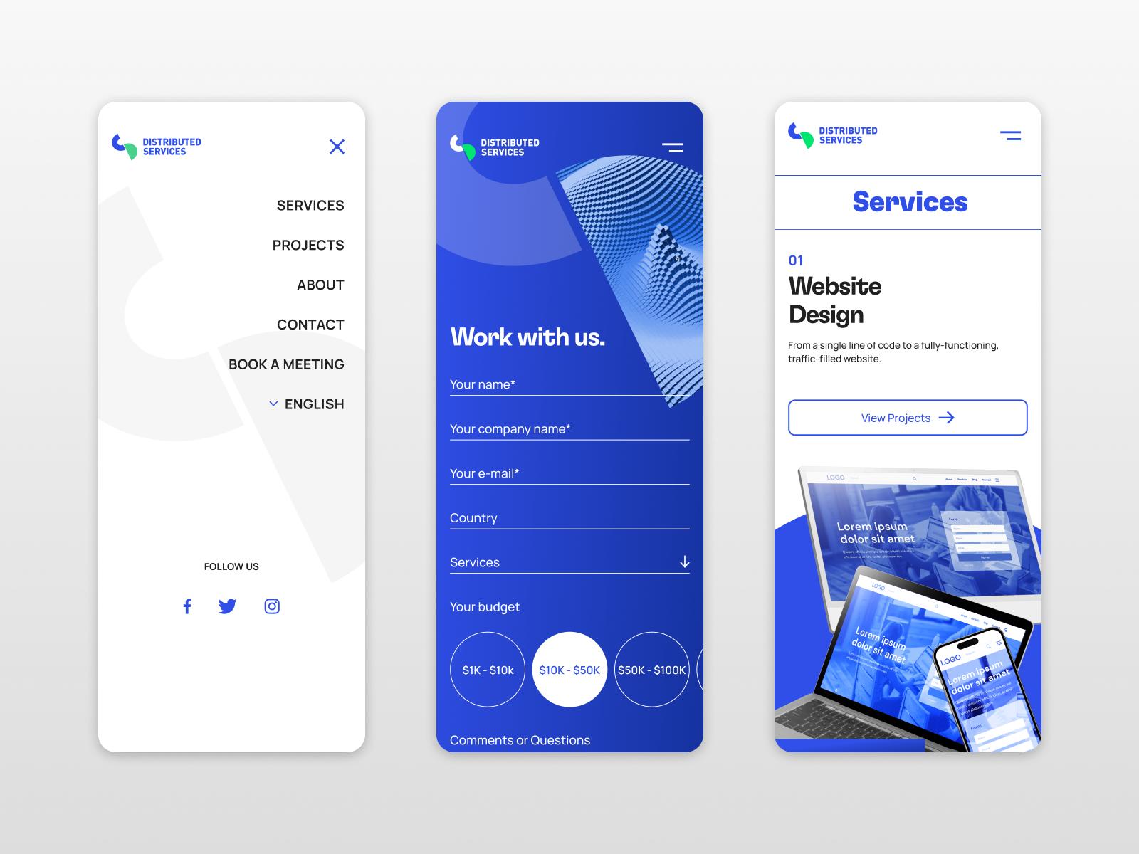
Mobile-Friendly Website: An Investment in Business Growth
A website is more than a digital address for your business. It can be a powerful tool for marketing, lead generation, customer engagement, and sales.
When your website works smoothly on mobile devices, you make it easier for customers to discover your business, understand your services, contact you, and eventually become customers.
That’s why responsive website design should be considered an essential part of your digital strategy—not an optional feature.

How Divine Art Lab Can Help
At Divine Art Lab, we develop modern, responsive, and business-focused websites designed around your goals.
From website design and development to responsive layouts, user-friendly navigation, modern UI, performance optimization, and conversion-focused pages, we help businesses build a stronger online presence.
Whether you need a new business website, website redesign, e-commerce website, or mobile-friendly website, our goal is to create a website that doesn’t just look good—it works for your business.
Upgrade Your Website. Improve User Experience. Grow Your Business.
Final Thoughts
Your customers are already using their smartphones to discover businesses like yours.
The question is: Is your website ready for them?
A mobile-friendly website can improve user experience, strengthen your online presence, support SEO, build credibility, and create more opportunities for leads and sales.
If your current website isn’t responsive, fast, easy to navigate, or designed for modern users, it’s time to make an upgrade.








Leave a Reply